Module 3 The View from Above: Satellite Imagery for Earth Observation
3.1 Preliminaries
3.1.1 Readings
Readings should be done when referenced during this week’s lesson. Do not read before starting the lesson.
3.1.2 Learning Objectives
By the end of this lesson, students will be able to:
- List advantages of earth observation from space
- Define spatial and temporal resolution associated with satellite image data
- Understand what image classification is
- Provide two examples of geospatial applications using satellite imgery
- Describe how high resolution image data differs from other types of image data
Activities for Module 3
- Readings
- Assignment A-M3
- Quiz Q-M3
Optional: Reading report [3 total for the course], Participation [minimum of 4 total for the course]
3.2 What is Earth Observation?
Earth observation (EO) is the processes and technologies for recording earth information from space. Typically EO is part of programs run by national space agencies such as the Canadian Space Agency (CSA) in Canada or the National Aeronautics and Space Administration (NASA) in the US. EO programs are designed to acquire information about the earth or the atmosphere and repeatedly sense regions of the planet to support the monitoring of change-over-time. EO is a subfield of the broader field of remote sensing which pertains to any kind of observation-from-a-distance, including drone-based image acquisition, aerial photography, even photography from kites! There is a third-year class devoted completely to remote sensing in GES department. as part of our Geomatics Option.
You actually already have some experience working with EO data. When you explored the landcover map in Week 1, that map was derived from EO data (from the Landsat sensor), which was produced by Canada Centre for Mapping and Earth Observation. There is a difference in terminology we should highlight here.
- A map is a visual depiction of a geographic variable or region of interest. EO does not automatically produce maps, rather
- EO technologies produce image data. Image data is direct physical measurements obtained by a sensor.
The simplest form of EO is analogous to taking a photograph from space, in which the sensor is sensing reflected visible light. The photo-taking device is the sensor, and in EO it is mounted on a platform, which is usually a satellite in a defined orbit.
3.3 The Earth Observation Process
3.3.1 Satellites
Satellite imaging of earth has been going on since the late 1950’s with the launch of the first satellites by the USSR and USA. The advantages of earth observation from space as opposed to from cameras mounted on aircraft which had been (and continues to be) a dominant form of remote sensing became apparent immediately. Aerial photography as the basis for generating geographic base data for mapping requires a designated flight campaign in support of it. As such, aerial photography is expensive, periodic, and more variable.
Satellite-based EO is extremely costly and can only really be undertaken by national government agencies and large corporations, however – once a program is in place data access can range from free to thousands of dollars per image. More importantly, satellites are placed into fixed orbits and have sensors that usually have regular schedules for acquiring images.
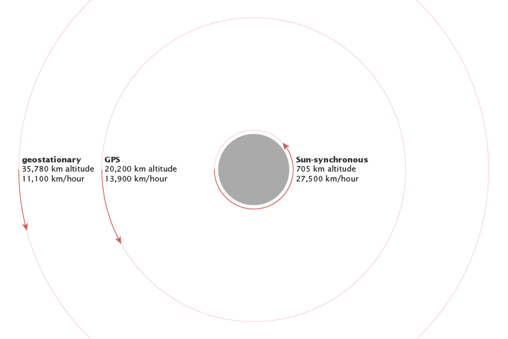, Freely available for use.](images/geo.png)
Figure 3.1: Three orbits used in earth observation satellites, NASA illustration by Robert Simmon, Freely available for use.
There are two orbits used in EO, noted in the figure above. A sun-synchronous orbit is at an altitude of 705 km, where sensors on satellites track the sunlit side of the earth in order to track visible light reflected from the earth. For sun-synchronous orbits a key property is how long they take to revisit the same location on earth. This is important for land monitoring and can have a critical impact on what type of monitoring we can do with the image data generated by the sensor. This property is called the revisit time or the temporal resolution. Revisit times are related to the swath width of the sensor (i.e., how wide an individual scene is). For higher resolution sensors, they tend to have smaller swath widths and longer revisit times, whereas lower resolution sensors have larger swath widths and shorter revisit times.
A geostationary orbit tracks the same position on earth as the earth revolves around its access. Geostationary orbits sit at altitudes of approximately 35,000 km. EO satellites that sense in the visible range of the spectrum are in sun synchronous orbits.
How spatial and temporal resolution combine to determine which applications can be targetted by a given EO sensor is a critical issue. You - as the EO expert - must be aware of all of the considerations in making the selection of appropriate imagery. A generic representation of this is provided in the figure below. Note that the axes are on logarithmic scales, so changes at lower ends of the scale are different from changes at the upper end of the scale. Try to make sense of this before moving on.
)](images/resolution-app.png)
Figure 3.2: How different temporal and spatial resolutions common in earth observation relate to geospatial applications they can be used on (Source: Jensen (2007))
Stop and Do - 1
Select two applications and provide an explanation for why they are linked with the spatial and temporal resolutions that they are in the image above.
.
3.4 The Earth Observation Process
We will now overview the following core components of the earth observation process.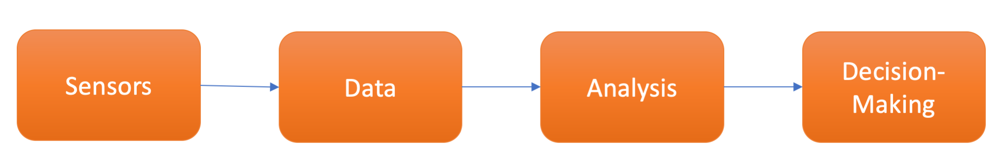
Figure 3.3: The earth observation process components are sensors, data, analysis and decision-making.
3.4.1 Sensors
The sensor component of the EO process is the technology on the satellite that actually records information from earth. Sensors can be either active sensors, sensors which emit some energy which is reflected back from earth and built up into an image, or they can be passive sensors which record reflected and emitted imagery from the earth.
Sensors can be designed in a wide variety of formats and specifications. What exactly sensors record is light, otherwise known as electromagnetic radiation, which can be characterized as waveform, denoted by its wavelength, or the distance between two successive wave peaks.
](images/wave.jpg)
Figure 3.4: Different characteristics of waveform energy. Wavelength is the distance between successive wave peaks, while amplitude is change in signal value from the centre to its peak (or trough). For a given amplitude, high frequency/short wavelength energy has more energy that low frequency/long wavelength. Source: CNX OpenStax
When we see different colours of a rainbow: red, orange, yellow, green, blue, indigo, violet what we are seeing as specific ranges of wavelengths of electromagnetic radiation. As such, the light recorded by sensors is categorized into three primary colours - red, green, and blue. That is, red light, green light, and blue light is recorded onto separately onto discrete bands of imagery. Importantly, these sensors can also record in other wavelength ranges of electromagnetic radiation, such as near-infrared (larger than visible wavelengths) or microwave (larger than near-infrared wavelengths).
Sensing in these parts of the spectrum allow us to see into parts of the earth that are invisible to the human eye. Near-infrared imaging has roots in military applications for detecting camoflauged installations that have different spectral characteristics in the near-infrared part of the spectrum than the surrounding vegetation. Modern military equipment and companies have developed camouflauge that is not sensitive to these sorts of spectral differences, as seen on this promotional video.
Note how they specifically describe how their camouflauge products are effective against specific parts of the elelctromagnetic spectrum. Many EO technologies have roots and are still actively developed in and for military applications. For example, In-Q-Tel - a venture capital arm of the Central Intelligence Agency (and in partnership with the US National Geospatial-Intelligence Agency), bought into a small DE company called Keyhole in early 2003 which had created technology for streaming image data onto a digital globe. The investment resuscitated the small firm, and integrated its technology into military and intelligence operations of the 2003/2004 Iraq War, which led to lucrative government contracts. In late 2004 Keyhole was acquired by Google, complete with CIA/military personnel and contracts, and the DE tool was soon rebranded as Google Earth.
3.4.2 Data
Earth information recorded by sensors is processed into image data files where the information is quantized into digital numbers that label pixels (small equally sized rectangular partitions) that make up an image. The image data is a square made up of pixels; each pixel has a single digital number which represents the amount of reflected or emitted electromagnetic radiation over the area of the earth covered by the pixel. The total area covered by a single image is called a scene. For example, the longest-running EO program Landsat, has a scene size of 185 km by 185 km, where each individual pixel is 30 m by 30 m.
The Sentinel-2 Program is a newer EO program launched by the European Space Agency (ESA) that has pixels arranged into image scenes that are processed into 10 km by 10 km areas. We can get a sense of the scale of information recorded by image pixels by visualizing image data at different zoom levels. Figure 3.5 below shows four views of the same Sentinel-2 image taken near Kakisa, Northwest Territories. The viewing scale in a is 1:100,000, which means one unit measured on the image is equal to 100,000 times that unit on the ground. As we adjust the viewing scale to 50,000 (b), 10,000 (c), and 2500 (d), two things happen.
- Firstly we can see the features of the landscape in greater detail.
- Secondly, the extent that is visible in the image decreases.
This viewing scale is normally called cartographic scale in mapping, and the terminology can be confusing. In short remember the following rule:
bigger number = smaller scale
smaller number = larger scale
So a 1:1,000,000 map would be a small-scale map, whereas a 1:1000 map would be a large-scale map. As we move from a thru to d we are moving from a smaller scale to a larger scale. As we do we can see more detail about the actual pixels that make up the image data.
Stop and Do - 2
Have a closer look at the data in the figure below, can you figure out what the spatial resolution of this dataset is?
Recall that the spatial resolution is the size of the pixel, usually specified in meters or decimal degrees. One way to guess this is to look at a feature in the image (road width, river bank) and try to count the number of pixels it takes to cover that feature. Then divide the expected length of the feature by the number of pixels, and you have your (guesstimated) spatial resolution.
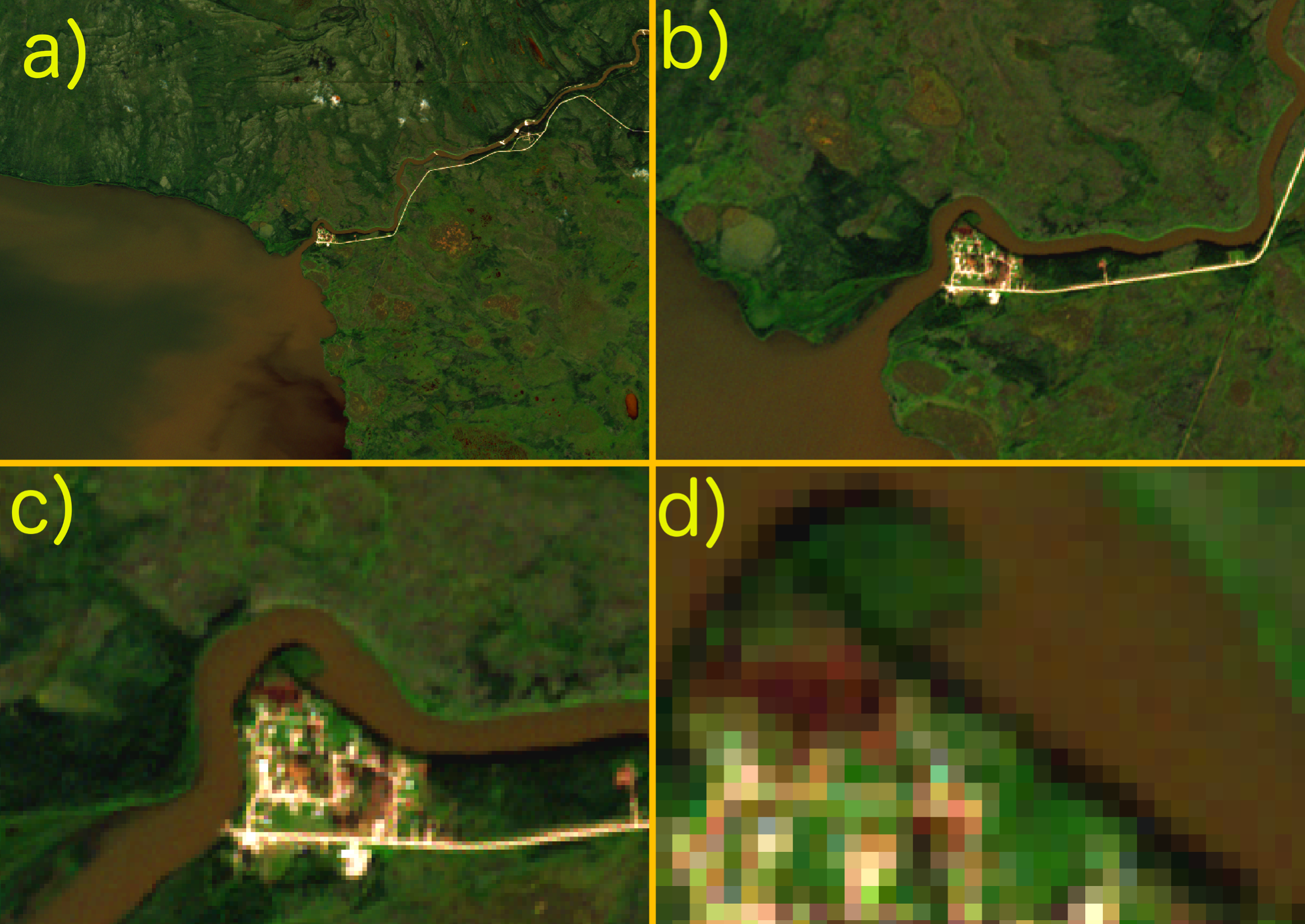
Figure 3.5: Sentinel-2 satellite image over Kakisa, Northwest Territories, visualized at relative resolutions of a) 1:100,000, b) 1:50,000, c) 1:10,000, and d) 1:2,500
Since these data are recorded as multi-spectral image data, the image channels/bands (i.e., discrete sections of the electromagnetic spectrum - in this case blue, green, red, and near-infrared light) can be combined in different ways. For example, a widely used band combination for monitoring vegetation is the normalized differenced vegetation index which is derived from the difference in the red and near infrared bands. It turns out that these bands behave very differently in health vegetation vs. unhealth vegetation, so we can use this to map vegetation health over large regions and to monitor vegetation over time. This has many applications in agriculture, forestry, and conservation. Again, selecting a sensor with the appropriate spectral bands for your problem is critical. 📖 Take a look and review the spectral bands in Landsat imagery.
Stop and Do - 3
Here is an overview of the Sentinel-2 program from its launch in 2015. List two geospatial applications that the Sentinel-2 program can contribute to and explain how it can, or does, make this contribution?
3.4.3 Analysis
Once data are sensed, transmitted and processed into image data, they need to be further analyzed into more useful information products. Because EO image data is so rich, the process of data analysis usually involves reducing the amount of information to more simple types of information we are used to dealing with using for decision-making. EO image data also lacks any abstractions we use in our conceptualiztion of the world around us. For example, the pixels in the Sentinel image above that are brightly coloured and are from surfaces in the village and road (buildings and gravel), do not know that they are part of those spatial objects (or semantic categories), rather they just record the reflected light characteristics of those surfaces. Thus in order to move toward the queryable earth as noted 📖 in the video keynote lecture, we have to associate pixels with spatial objects or semantic categories in order to reason and make use of these rich data sources.
One of the main ways to go from EO image data to richer DE data is to do what is called image classification. In simple terms, image classification is a process of training an algorithm (i.e., a set of instructions a computer program to carry out on the image) to associate pixels in image data with particular labels that those pixels are associated with on the ground. When we view the image in the Kakisa figure above, we naturally recognize which pixels are in the river, which are on land, which are on the road, etc. Let’s think a little more about how and why we make these associations.
- Colour: seeing variation in colours in the image tells us about different surface features. Green looks like vegetation and brown looks like sediment-laden water.
- Shape: the river coming in to Kakisa Lake on the right side of the image looks like a river primarily because of its shape, as a sinuos line-like set of pixels
- Context: where pixels are located on the image provide a rich about of information about what features on the landscape they are part of. If we extracted only the brown pixels, we would get many of the pixels in the river and on the lake, but we would also get some of the pixels on land in the vegetated area. These are sedges or bogs which have the same approximate colour as the sediment-laden water, but because they are located within a complex of green pixels, and distance inland from the lakeshore, we immediately recognize them as part of the land and make an association to a landscape feature or landcover based on this.
It turns out that when we view an image like this, the human brain is doing a lot of complex perception and association tasks that we take for granted. The context component is probably the most important, however most traditional image classifications focus only on colour (i.e., spectral characteristics of the pixels). Only recently have image classification algorithms started to incorporate shape and context into their approach to classifying pixels as part of more meaningful spatial objects or landcover categories. Once pixels are classified in this way, they are queryable and can be used to generate answers about environmental change, urbanization, conservation, and related environmental issues.
3.4.4 Decision-Making
EO technologies - as we have already seen - can be used in a wide variety of geospatial applications. Ultimately however these data need to be used to generate new insights, drive decision-making, and improve our ability to manage and solve complex environmental problems. This aspect of EO is relatively under-developed. In environmental research, EO data is typically used as a data source to investigate questions about spatial distribution or change over time. Conclusions are drawn by analyzing the quantities of interest visually or statistically and/or correlating them with field measurements. However scientists are generally interested in discovering processes, confirming hypotheses, improving their understanding of how processes are operating, rather than specifically developing policies or solutions that address these problems.
Academic and government scientists are major users of EO data, and have been key players in improving and developing the science and technology of EO for the past several decades. In Canada for example, federal agencies such as Environment Canada, Natural Resources Canada, and Agriculture and Agri-Food Canada all have extensive EO programs for monitoring aspects of the environment from space.
3.5 Crop Monitoring in Canada - Earth Observation in Action I
One of the most obvious geospatial applications of EO is agriculture. Agriculture is vitally important industry to virtually all countries and is highly dependent on a variety of natural processes such as weather and climate, soils, water resources, as well as socio-political dimensions of environmental regulation. Thus EO has potential applciation in agriculture at a variety of scales from providing information about how crops are growing within individual fields, all the way up to entire agricultural regions, such as The Prairies in western Canada.
Agriculture and Agri-Food Canada (AAFC) is the federal agency overseeing agriculture and the food production industry in Canada. They use EO to produce an annual crop inventory dataset each year that identifies what crop is being grown in each pixel covered by the dataset. This data is produced by combining several EO datasets, and mapping their spectral characteristics to in-situ data where the crop types are known. This allows the development of an algorithm to predict crop type from space in an auomated manner, enabling national-scale monitoring of agriculture from space.
Stop and Do - 4
Take a look at the AAFC Annual Crop Inventory Dataset here.
1. Use the address search tool to zoom into your home town and try to find the nearest farm to where you grew up. If you grew up in an urban area you may have to zoom out a bit; if you are not from Canada or from an area with no agriculture around, just use your current address. Make a note of what seems to be a common crop type for a specific farm.
2. Next go to the same location in Street View using Google Maps. Try to use the Street View feature in Google Maps to get a ground view of the farm, or zoom in to get the highest resolution overhead view of the farm.
3. Navigate around and explore different views on the same location.
Answer the following questions (you may want to use the answers below as the basis for a post in the Course Discussion);
- What was the dominant crop type as predicted by the crop inventory dataset?
- What was different about viewing the data using ACI vs. using Google Maps/Streetview? Which is the more useful way to view the farm? Why?
- Which view of the farm do you think would be more useful for government? What about the owner/operator of the farm? Why?
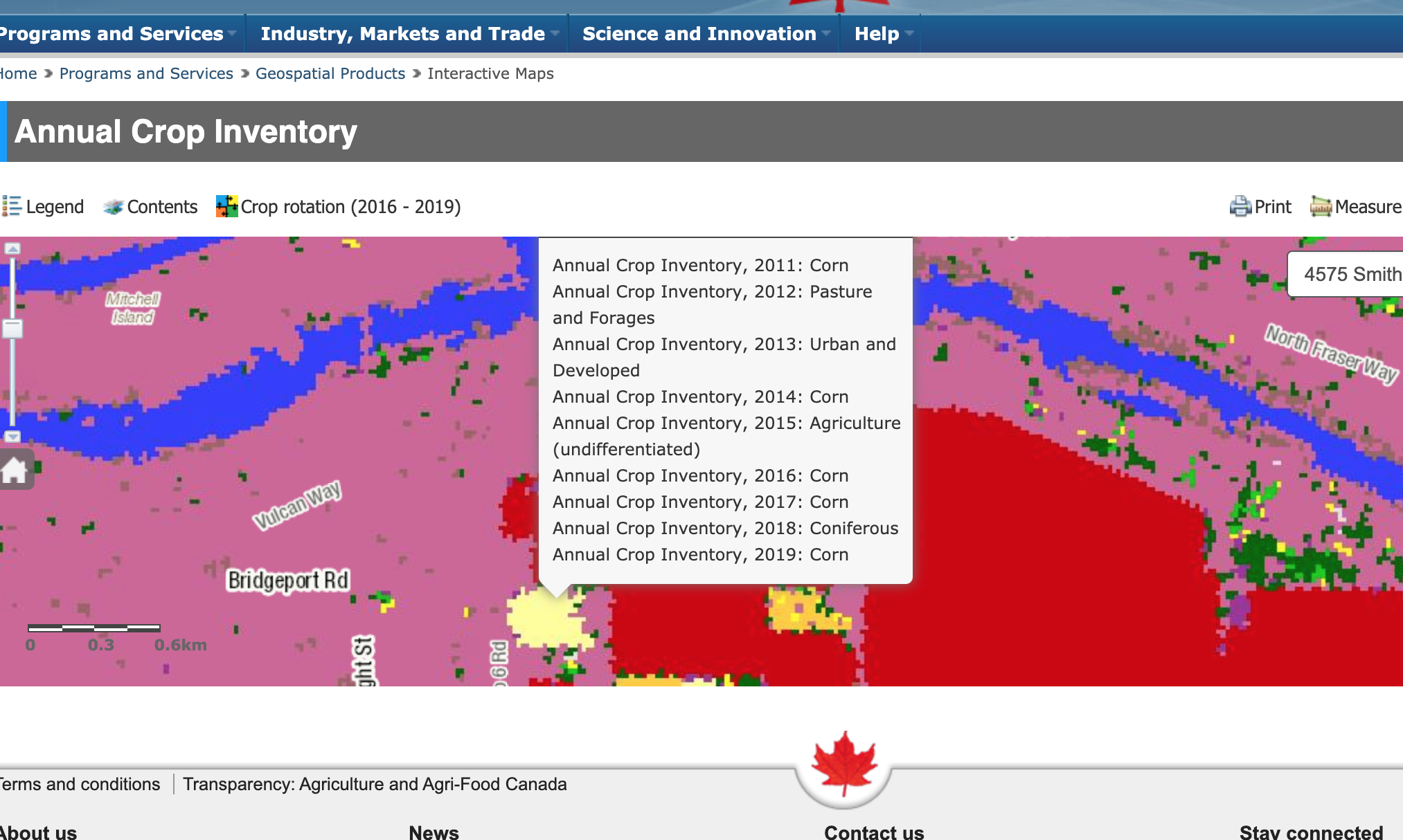
Figure 3.6: Clicking on a pixel in the web-map of the AAFC Annual Crop Inventory gives the history of predicted crop types for that location. Source. Screenshot by Colin Robertson. Used with permission
End of week 3, start of week 4.
3.6 Earth Observation Data for Digital Earth
So how does EO relate to DE? Well, EO comprises a large share of DE data. As EO programs continue to grow, the historical archive of image data provides a longer time series with which to compare current trends to.
The question that often arises when tracking and monitoring environmental change is; how unusual is this change we are observing today?
Answering this question requires temporal data. For some types of data such as weather stations, this often goes back to the 1950s or 1960s. The longest continuously running EO program is the Landsat program, which dates back to the 1970s. Since we are now on the verge of launching Landsat 9. With each successive iteration of a Landsat sensor, technology has improved, and things change slightly. For example, in Landsat 1-Multi-Spectral-Scanner (MSS), channel 1 is the green band, and the spatial resolution of each pixel is 80 m, while in Landsat 8, channel 1 reflects blue/violet light, and the spatial resolution is 30 m. Thus in order to do longterm DE studies, often some data processing (e.g., to align green bands on imagery from different sensors) is needed to harmonize data so that things line up as expected.
What we will cover in this week is how DE has changed and is changing traditional EO technologies and tools. As more data is collected, archived, and made accessible - more sophisticated applications and questions can be designed that make use of these data resources. This integration of disparate EO datasets is a key backbone of the DE vision as articulated in Week 1 and echoed in the keynote video at the start of of this module.
3.6.1 Hyperspectral Data
One relatively recent development has been the expansion from multi-spectral image data, which records usually 4-15 bands of spectral data, to hyperspectral image data, which might have hundreds of image bands over the same chunk of the electromagnetic spectrum. As you would expect, that means these bands are much narrower, and thus sensitive to very small regions of the spectrum. We can visualize the difference in how multispectral bands vs. hyperspectral bands cover the spectrum in the image below.
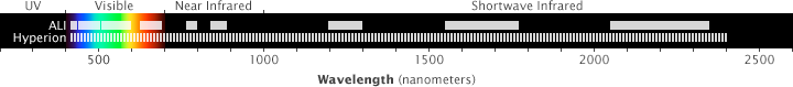
Figure 3.7: Hyperspectral (Hyperion) and multispectral (ALI) image bands relative to the electromagnetic spectrum. NASA illustration by Robert Simmon. Freely available for use.
The obvious question that arises is why do we need so many bands of data? Hyperspectral imaging essentially covers the entire spectrum of visible, near IR, and short-wave IR electromagnetic radiation. In this way, a spectra can be built up showing the reflectance curve of the surface being imaged across these wavelengths. This is analogous to spectroscopy studies, which can detect chemical constituents of surfaces based on their spectral profiles.
As such, hyperpspectral EO can be used to detect actual minerals and chemicals present in the surfaces being mapped. A question that emerges with hyperspectral data in particular, but also with the DE data more generally, is how to organize all of this data so that it is accessible and easy to use. In traditional EO analysis, image data are stored as files on disk, in common formats such a geotiff or Mr.Sid. However as the data volume gets bigger, managing and accessing data in files becomes challenging. You can imagine if you had a directory of 7 million word documents on your computer, finding the one that had your grade 11 English assignment might be challenging. Your approach to finding might be to sort by name if you knew the file name or used a naming convention, or sort by date to try to narrow down to files that are from the approximate time frame. This is the task of information retrieval and is a huge area of research in itself (Google is essentially the product of information retrieval research - where the information to be retrieved was relevant web pages to a given text query).
So what is the Google for the Digital Earth?
Unfortunately, it does not exist (yet). Different technologies have been proposed for how to organize EO data so that they are quickly accessible, but a leading platform has not emerged. We’ll quickly review one of the more popular approaches.
3.6.2 Data Cubes
A data cube is a logical extension of the regular rectangular array of pixels we store image data in. In a single image the data file is two dimensional, if we stack a bunch of image data files together, we get a three dimensional structure called a data cube. Just like any index, a data cube needs a way to organize its data (similar to how an index in a book is organized alphabetically). A three dimensional data cube might have latitude, longitude, and time as the three dimensions of the cube. As such, a given pixel defined by the intersection of a latitude and longitude will be aligned with values for that pixel at all other times in the cube. We usually denote these three dimensions X Y and Z.
. Licensed under Creative Commons 4.0.](images/cube.png)
Figure 3.8: Visual depiction of an earth observation data cube. Kopp et al. 2019. Licensed under Creative Commons 4.0.
The key property of a data cube is that all of the hard work goes into getting data into the representation but once it is there it is fast and easy to query and access its information. For example, a data cube of landsat data over all of Canada would have to first define what pixels are in and out, how to process raw landsat scenes into just the Canada pixels, how to deal with pixels on edges of scenes, how to deal with aligning image bands from different landsat sensors, how to handle differences in atmospheric, and many other issues. However once all of these problems are solved and the data are indexed in the cube, it is fairly easy to query and use information from massive amounts of data. One of the other very useful properties of the data cube is that new quantities can be computed and stored as layers in the cube. So for example, precomputing vegetation indices for each year and storing those would enable simple analysis of vegetation over time. Since these are only computed once and then stored, they are very fast to access by computer programs, as opposed to computing them on-the-fly in response to a user’s request/input.
3.6.3 Google Earth Engine and Data-Analytic Pipelines
Regardless of where and how EO data are stored, we also need analysis tools to generate answers and insights to the problems we’re working on. In the vast majority of studies and applications using EO data, the generic workflow model is as follows
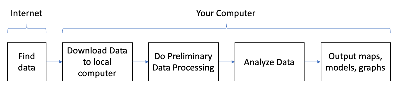
Figure 3.9: Analysis workflow for earth observation data
While this workflow model has served the EO and geospatial community well for decades, as the DE becomes a reality and EO data archives become larger, this model of working with data is no longer feasible. It requires massive amounts of bandwidth for moving data from the web to your local machine, requires massive amounts of storage space, and massive amounts of computer memory when working with large data files. A more modern workflow is to keep data in the cloud – that is, on servers on the Internet, and do processing and analysis via a web browser. This workflow - which we might call a cloud-enabled EO workflow, allows massive amounts of data to be processed and analyzed from virtually any computer with a web browser.
One platform that has made the cloud-enabled EO workflow a reality in recent years is https://earthengine.google.com/ (GEE). GEE is a completely ‘cloud-based’ platform which includes access to massive amounts of DE data, in addition to computational tools that allow you to create data processing and analysis pipelines.
Here is an example of the workflow based on GEE in a recent paper mapping the year trees were planted in California orchards. In this research project, different types of tree-planting scenarios are detected by the temporal pattern in their NDVI as recorded in Landsat EO data. Do you remember what NDVI measures? Why would this be a good indicator of tree growth?
](images/gee.png)
Figure 3.10: Google Earth Engine workflow for EO analysis, sample analysis for a project mapping tree age in California orchards, source: Chen et al. 2019
Stop and Think - 1
What do you think the benefit of using GEE for this application was? Can you think of any disadvantages to taking this approach?
The cloud-enabled EO workflow and its incarnation in GEE is a huge step forward in realizing the DE vision.
3.7 High Resolution Imaging
High-resolution EO can be defined roughly as sensors generating data products at 10 m resolution and under. This means that as resolutions get higher – for example the high resolution optical imager on the Pleiades satellite senses data at 2.8 m, GIS-MS on GeoEye satellite is 1.65 m, and Radarsat2 records in at 1 m – finer objects and land surface features can be detected and monitored. The number of high resolution EO sensors has increased dramatically over the past decade and is enabling new types of geospatial applications.
📖 Read through this blog post which compares high and moderate resolution imagery, pay attention to the folowing terms: coverage, tasking, cost, spectral bands, and history. Note the source of this article and consider when reading through.
3.7.1 Object-based image analysis
One particular feature of high resolution EO data that is unique, is its ability to be used to detect spatial objects. A spatial object is any describable object in an image that can be accurately detected and extracted. As noted in our discussion of image classification, being able to add meaning to groups of pixels – as landcover categories, or in the case of high resolution imagery, as individual buildings, ponds, and roads. Once these groups of pixels can be treated as discrete objects, much richer analysis of their distribution, properties, and change-over-time can be realized. High resolution EO data - due to its fine level of spatial detail, requires new ways of doing analysis. For moderate and lower resolution data pixel-based analysis approaches are widley used. However for high resolution analysis, utilizing information about geographic context is even more important.
Object-based image analysis is a suite of methods that share two broad steps. First is what is called segmentation, and this means grouping pixels together into homogeneous chunks. Just as if you are looking at the roof of a building, it will primarily be one colour, we would automatically group all of the roof pixels together based on their spectral characteristics (e.g., colour).
The second step is to classify these segments to give them meaning, so labelling roofs as roofs and so on. At this point different ways of combining labelled segments together can be created, in order to create so called hierarchies of objects, such that a road segment within a park is classified differently than a road segment outside of a park. These sorts of rules can be built up to create very informative and detailed maps derived from high resolution imagery. As you might expect, this sort of analysis is more common in urban landscapes where there is a wide variety of object-like features in close proximity.
3.8 Monitoring Forest Carbon from Space - Earth Observation in Action II
Forests are critically important for climate change, acting as both carbon sources or carbon sinks. Forests act as sources of carbon when they are burned down or decay after dying. However, when trees photosynthesize they convert carbon from the atmosphere to organic mass making up the tree, and in this way forest growth acts as a carbon sink. Thus, monitoring forests is a critical part of national-scale carbon accounting projects, which countries must do to measure progress towards carbon reduction targets. In Canada, there is an estimated 347 million hectares of forested land, making this the critical information need. Given the huge landbase covered by forests, understanding their role in the carbon cycle is a perfect application for EO approaches.
One way EO data is utilized to help monitor Canada’s carbon budget is through the National Deforestation Monitoring System. This is a system of mapping and reporting technologies designed to work together to measure how much forest is lost in Canada in a given year.
Note that deforestation is not the same as harvesting trees or trees lost to wildfire, rather deforestation is the direct human-induced conversion of forested land to non-forested land. Landsat imagery is the core EO data used for mapping forested areas and detecting deforestation events, in addition to a suite of related geospatial data products including aerial photography, park boundaries, oil & gas industry data, and high resolution imagery. The figure below shows how Landsat data are combined from different time periods to detect forest loss.
](images/deforest.png)
Figure 3.11: Examples of various Landsat satellite band combinations and change enhancements that may be used in the mapping process. Note the change enhancement at right shows red triggers where vegetation loss or change has occurred. Band combinations shown are normal colour rendition on left, with colour infrared in the middle. The right-hand column shows Landsat Thematic Mapper (TM) and Enhanced Thematic Mapper (ETM) bands 4,5,3 (i.e., the two near infrared bands and a red band) displayed as red, green, blue, source: Dyk et al. 2015
3.9 Summary
We have spent these two weeks examining how EO technologies have transformed our abilities to map and monitor natural and human processes at unprecedented scales. We have rich and growing archives of EO data from some satellites, and new and higher resolution EO data coming from newer commercial satellites. We also have new ways of analyzing these data to extract key insights, and a move towards a cloud-based workflow for people working with EO data. There is clearly a synergy between the queryable earth and the digital earth that is now becoming a reality and fueling more and more geospatial applications. Being able to understand, critically evaluate, and use these applications are important skills and knowledge for applying the DE to the problems you are most interested in.
3.9.1 Key Terms
- image data
- geostationary orbit
- sun-synchronous orbit
- multi-spectral
- hyper-spectral
- image classification
- cloud-enabled EO workflow
- spatial object