Module 7 GIS and Big Data
7.1 Preliminaries
7.1.1 Readings
Readings should be done when referenced during this week’s lesson. Do not read before starting the lesson.
7.1.2 Learning Objectives
By the end of this lesson, students will be able to:
- Appreciate the types of decision making that goes into a big data analysis project with geospatial data
- Ask three critical questions of any data intensive project or study
- Explain what the five v’s of big data are
- Give an example of how GIS and Big Data can help to both exacerbate and address complex social issues
Activities for Module 7
- Readings
- Assignment A-M7
- Quiz Q-M7
Optional: Reading report [3 total for the course], Participation [minimum of 4 total for the course]
7.2 Overview of Lesson
This week we will take a different approach to learning about the digital earth. Instead of reading about it, we will engage in a live analysis of data. This complete week’s lesson will be generated using R, a free and open source, widely used statistical programming language used in data science and modelling.
7.3 Live Worked Example of Geospatial Data Analysis
What we will be showing here is R code “snippets” which when the webpage is compiled, actually acquire geospatial data from external sources, process them, and create visualizations from those data on the fly. You do not need to know or memorize these code snippets, they are provided to illustrate what this sort of analysis looks like (R is one of the most widely used data science languages and has lots of resources out there to learn more about it!). If you want, you could download and install R on your own computer and reproduce these analysis.
What the code below does is go to that website and retrieve this dataset as a geojson file which is a text-based file format for interchange of geospatial data. We don’t need to learn all the ins and outs of the format now, but it’s important to note it includes both geometry (in this case neighbourhood boundaries) and tabular dimensions of the data (various crime statistics reported at the neighbourhood level).
library(geojsonio)
library(sp)
spdf <- geojson_read("https://opendata.arcgis.com/datasets/af500b5abb7240399853b35a2362d0c0_0.geojson", what = "sp")This loaded two packages (i.e., extra pieces of R code that add functionality to the base R software and are added as required by the user) with the library command, then the geojson_read function went out to a website maintained by the Toronto Police Services through a platform called ArcGIS and retrieved a live file of police crime data. This dataset provides crime statistics for the City of Toronto aggregated by neighbourhood. You can read more about this dataset here.
Now that we have this data in hand - what can we do with it? For starters we can plot it using the following one line command;
plot(spdf)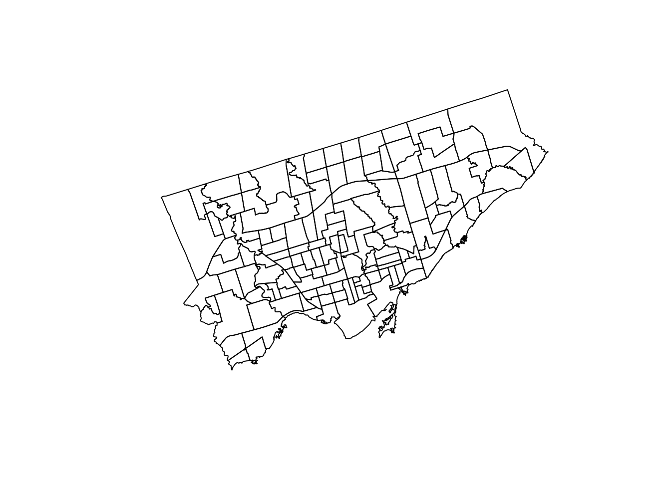
Figure 7.1: Map of the City of Toronto neighbourhood boundaries.
What is shown here is geospatial data (i.e., data includes the location of the data on the earth). The data are the boundaries of neighbourhoods in the City of Toronto. What is not yet shown is all of the crime data that is also included in the file we downloaded from the Toronto Police Service. We can get a list of what is included in the tabular data attached to the boundary information file using the following command,
names(spdf)[1:15]## [1] "OBJECTID" "Neighbourhood" "Hood_ID"
## [4] "Population" "Assault_2014" "Assault_2015"
## [7] "Assault_2016" "Assault_2017" "Assault_2018"
## [10] "Assault_2019" "Assault_AVG" "Assault_CHG"
## [13] "Assault_Rate_2019" "AutoTheft_2014" "AutoTheft_2015"This command has generated a list of all the column names contained in the tabular part of the data set. When we view the column names of a dataset, sometimes we can infer what the columns mean, other times it’s more cryptic. It is generally good practice to consult the metadata that is, data about the data which describes the data. If we return to the link above, we can read about what information each of these columns stores. Looking here we we can see that crimes are broken down into type, and sometimes linked to a specific year between 2014 and 2019, or given as the average over that period.
Let’s map Break and Enters in 2014 just to get a feel for the data
spplot(spdf, "BreakandEnter_2014")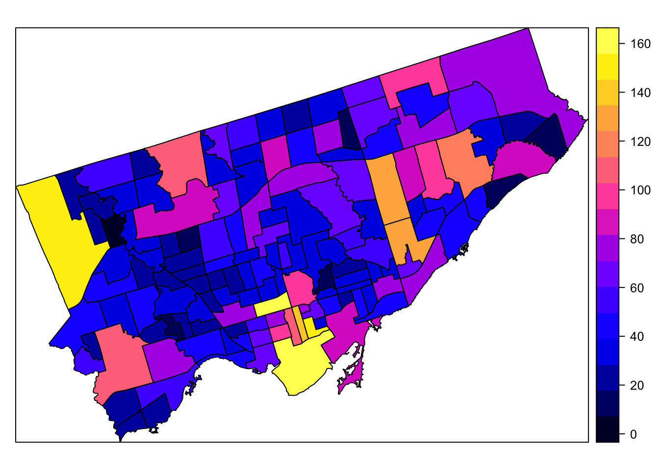
Figure 7.2: Map of the City of Toronto neighbourhoods with shading representing break and enter crime data from 2014.
This allows us to see the downtown core and one of the northwest neighbourhoods had the highest rates of break and enter crimes. We can also see general spatial patterns by visualizing the crime data in this way. Before going further we should figure out exactly what we are looking at. The values in the legend range from 0 to 160.
Go back to the web page and review the description of the data.
We see that the crime is reported as crime rates per 100,000 people by neighbourhood based on 2016 Census Population. Viewing the data as rates makes it possible to compare areas independent of their population (i.e., otherwise areas with highest population would likely have the highest raw totals of crime events). Most crime analysis uses crime rates rather than raw counts for this purpose.
The above however is a static map, and we can make it more interactive using a web map. Currently, one of the most widely used web mapping programs out there is called leaflet which is a JavsScript library and can do some pretty amazing things. You have already interacted with leaflet maps in earlier weeks. Let’s make a leaflet map using some more R code as follows;
#load the leaflet library
library(leaflet)
library(sf)
leaflet(st_as_sf(spdf)) %>% addTiles() %>% addPolygons() Now this is is an interactive map meaning we can zoom in and out and click on things unlike the static image map we saw earlier. This interactivity allows for far more exploration of the data. This is especially important when working with big data because we may not know in advance everything we want to find out about. Exploratory data analysis is a type of analysis that emphasizes exploration - and there are many tools available for exploratory spatial data analysis.
Stop and Do - 1
Spend some time zooming in and panning around this map. We can see that the default colouring of the City of Toronto neighbourhoods is a transparent blue with a darker blue boundary. Also take a look at the basemap underneath - you can see in the status bar below that leaflet is using an OSM basemap - a project we learned about a few weeks ago.
Now we will want to do a little more with our leaflet map because it currently is not showing any crime data. The following R code allows us to add this crime rate information to an interactive map,
#convert from a spatial object to an simple features object
spdfsf <- st_as_sf(spdf)
#set the colour scale
qpal <- colorNumeric(palette = "YlGnBu", domain = spdfsf$BreakandEnter_AVG)
#call the leaflet function
leaflet(spdfsf) %>% addTiles() %>% addPolygons(stroke = FALSE, smoothFactor = 0.2, fillOpacity = 1, color = ~qpal(BreakandEnter_AVG)) %>%
addLegend("bottomright", pal = qpal, values = ~BreakandEnter_AVG,
title = "Break and Enters Average Count <br> 2014-2019",
opacity = 1
)Now we have a much better map showing the average crime for Break and Enters for the 2014-2019 period by neighbourhood in the City of Toronto. No we can see the spatial patterns in the crime rate a little more clearly. If you take a Cartography class (e.g., GG 251) you will learn all about how selecting the appropriate colour scale and the map elements are critical for making an effective map.
The last thing we can do is make this crime map a little bit more interactive. Right now we can see approximately what the crime is by looking at the colour on the map and the legend. But if we wanted to know, for example, the exact average crime count in Mimico - it would be hard to figure out with this map. We can add more interactivity using the tabular data attached to the dataset to enable this type of inquiry.
We want to add a few things to this interactive map;
- the ability to click on a neighbourhood and see its name - this would help us answer the question what neighbourhood is this when we see something of interest. An alternate way of doing this would be to label every neighbourhood
- a link to other information about the neighbourhood
The R code below adds this functionality to our interactive map,
leaflet(spdfsf) %>%
addTiles() %>% addPolygons(stroke = FALSE, smoothFactor = 0.2, fillOpacity = 1, color = ~qpal(BreakandEnter_AVG),
popup = paste0(
"<b>Neighbourhood: </b>"
, spdfsf$Neighbourhood
, "<br>"
, "<b>Crime Count: </b>"
, spdfsf$BreakandEnter_AVG
, "<br>"
, "<b>Population: </b>"
, spdfsf$Population
, "<br>"
, "<a href='https://www.toronto.ca/ext/sdfa/Neighbourhood%20Profiles/pdf/2016/pdf1/cpa", as.numeric(spdfsf$Hood_ID), ".pdf'>View Neighbourhood Profile</a>"
)) %>%
addLegend("bottomright", pal = qpal, values = ~BreakandEnter_AVG,
title = "Break and Enters per 100,000 <br> 2014-2019",
opacity = 1
)What we see above is a lot of code that is formatting the popup label on the map. You definitely do not need to try to understand all of this. The key thing is we can create a relatively complex interactive map using publicly available data and linking to external report data in a few minutes. One of things we are doing here is using the Hood_ID column which is a unique identifier of each neighbourhood, which is also used on the City of Toronto website in the file name of the reports that are PDF format. So we build a link to the external document using the Hood_ID in the dataset. Connecting data from different sources is a key aspect of working with big data. Often this involves reading metadata to find out what specific columns mean and how they link to other information sources.
7.4 Geospatial Data and Crime
Now that we have a little bit of a feel for the crime data published for the City of Toronto, we can think more deeply about what it means, how it can be used, and potential sources of bias and/or ethical issues of using these data sources.
Crime mapping goes back at least two decades, and is premised on the belief that spatial patterns of crime can be used to understand root causes of crime, to aid in solving existing crimes, and to prevent the occurence of future crime through geographically targetted community policing. Many police departments now employ crime analysts (often geographers) whose job it is to analyze crime data. The existence of crime mapping databases and software has led to the proliferation of the notion of a crime hotspot, which is a geographical area with an elevated crime rate. In the mapping above we used the average count of crimes but normally we would want to know the crime rate. Crime events are typically standardized by some measure of the size of the population. For instance, 5 murders in a neighbourhood composed of 1000 people has a wholly different level of risk than 5 murders in a neighbourhood made up of 10,000 people.
Standardizing counts of crime events relative to the size of the population helps us to understand the relative risk of crime. Note that crime rates are typically enumerated over some geographic unit. In the example of break and enters in Toronto we used above, the geographical unit of analysis was City of Toronto official neighbourhoods. Let’s examine these in a little more detail by zooming in to one particular neighbourhood:
Here we have made two changes to out previous map. We set the fillOpacity parameter to 0.6 so that we can now see through the colours a little bit to see the basemap. Secondly, we have zoomed in to a particular part of the east side of the city, along Queen Street East.
What do you notice here?
If you click north of Queen Street East you find a crime rate of 601.7 in Regent Park, whereas if you click south of Queen Street East in Moss Park, you find a crime rate of 1141.1. If this map is to be believed, the second we cross Queen Street east the crime rate instantly doubles.
Is this real? What is happening here?
Well to some extent this is really the result of the geographical units over which we computed the crime rate. A key property of these sort of areal measures is that they really only apply at the entire neighbourhood level, not at any particular location within that neighbourhood. This may seem counterintuitive - because it is - and people frequently misinterpret what these sorts of maps and numbers actually mean.
Now let’s think a little further about what we are seeing here. These are crime rates for crimes which are categorized as break and enter crimes. We would normally consult the metadata to find out more about what this crime data actually means - however in reality the metadata is often lacking as is the case here. We sometimes have to do some digging to understand the data we are looking at, for example we could look at the definition here to see we are talking about property crime. Thus if the make up the housing stock in these two neighbourhoods is different that might explain some of the discrepancy in crime rates.
Stop and Do - 2
Have a detailed read of the Neighbourhood Profiles for both Regent Park and Moss Park. Try to look for clues that might explain the discrepancies in crime rate between these two neighbourhoods. Write down two sentences about how you think police might use this data to do their job. Can you think of any dangers or risks of using these data to inform police practice?
7.4.1 What is Crime Data
If you have seen the movie above - Minority Report - you probably know this was a science fiction movie about crime prevention released in 2002. The basis of the plot is that an advanced technology allowed police to see when crimes were going to happen before they occurred so that the future criminal could be apprehended and the crime prevented. While far-fetched futurism in 2002, today police services around the world are using big data and geospatial tools to attempt to forecast crime and deploy resources in advance, not too far behind what was depicted in the movie.
Crime data such as those we explored above are really a measure of criminal activity, one that has sources of bias and significant limitations. If we imagine crime as an invisible process happening out in the world which we are trying to learn about, we can envision police statistics of criminal offenses as one limited view into this process. It is worth thinking about all of the sources of error, bias, and noise that impact this view. Things such as
- type of crime - so-called white-collar crime (e.g., fraud) might be less likely to be detected than street crime
- shifts - when policing shifts start and end and number officers deployed at a given time impact the overall policing effort and likelihood of detecting crime happening in the community
- location bias - if police effort is not deployed evenly, but in relation to perceived crime risk - such as in so-called hot-spot policing, crime is more likely detected in these area and less likely to be detected in other areas
- racial profiling/discrimination - if police disproportionately stop or pre-emptively investigate members of a certain race or ethnic group, they may show up disproportionately in crime statistics an issue which has been in the news in recent years in Toronto
And these are just a handful of examples. It is important to realize that crime data are not a true reflection of criminal activitiy, but rife with sources of bias and error in addition to complexities of working with aggregate data expressed as rates.
7.5 Crime Data as a case of Big Data
Interest in a data-intensive approach to policing which requires extensive data, statistical modelling, geospatial forecasting, and related tools and technologies has increased greatly in recent years. This transformation in policing is analogous to how big data coupled with advanced machine learning and artificial intelligence algorithms is transforming almost every industry and field. What does it mean for data to qualify as big data? Usually big data is defined according to the multiple V’s model of big data, which relates to:
- Volume - the actual size of data - as measured in quantities of bytes (which itself is a collection 8 bits, where each bit which can store either a \(1\) or a \(0\))
](images/big-data.png)
Figure 7.3: Growth in amount of global data over time, image source IDC
- Velocity - measures the speed at which data is created or accumulated. Data may stream in at 1 byte per hour or 2 mb per millisecond.
- Variety - the format and type of data has increased greatly in recent years. Even with purely geospatial data, there are more formats and varieties of geospatial data (e.g., vector formats, raster formats, video formats, sound formats, etc.)
these are the core V’s of big data. But two others have been defined more recently as well, these are:
- Veracity - which is about the quality of data, which can be highly variable and lead to biased or incorrect results
- Value - is the insight and value derived from analyzing larger datasets. This is an often overlooked aspect of big data but is crucial. If we need a bunch of new computational platforms, algorithms, and skilled professionals all to analyze data and learn nothing more than what we already knew in the first place - is it really worth it? Value of big data is derived from new insights made possible by seeing patterns and connections which are otherwise invisible.
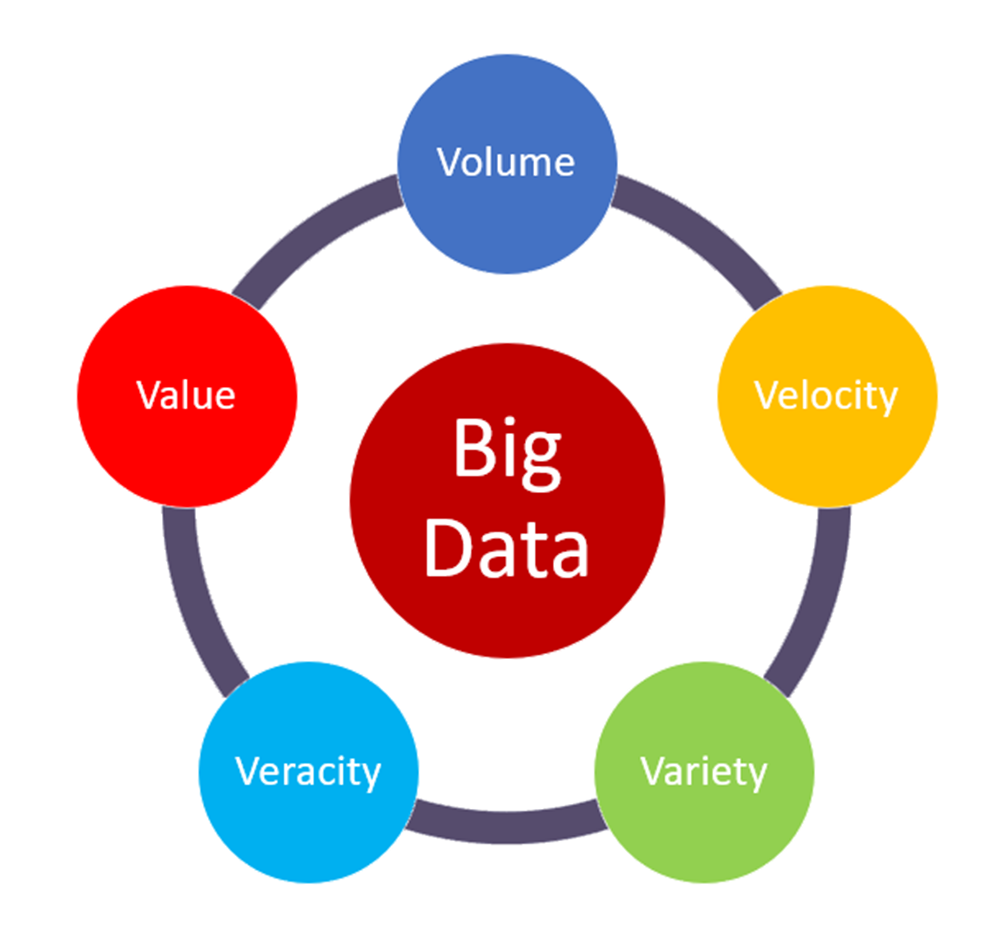
Figure 7.4: The five V’s of big data, source: https://medium.com/@suryagutta/the-5-vs-of-big-data-2758bfcc51d
Each of the five dimensions of big data apply to the case study of crime data as well, increasing in volume and velocity as more GPS sensors are deployed, web-based reporting replaces paper-based methods, and overall more parts of police practice are digitized and coupled to analytics. More variety in data - from point events associated with street addresses of service calls to bodycam video footage, more variety of formats is now created. Data quality issues are harder to track and less frequently reported but are likely increasing as well as the volume of data increases. A recent example of data quality issues in a military setting provides a clear example of the worst case scenario, where positional errors of up to 13 metres were known and ignored in operations used for drone strikes in Iraq. Being a critical and informed consumer of geospatial data and all big data services requires thinking carefully about how data are created, processed, and utilized.
Stop and Think - 1
Imagine you were contracted by the Region of Waterloo as a data expert to help with a new initiative aiming to address problems of homelessness in the Region. They want to take a data-driven approach to program development and resource allocation. How could geospatial data and Big Data be used in this context, what would some potential advantages and risks be?
7.6 Crime Statistics in City of Toronto
In our leaflet maps we made above, we explored only one variable in the dataset, BreakandEnter_Rate_2019 which reports the 2019 rate of break and enter crimes at the neighbourhood level. What if we had a more generic question about crime in Toronto, such as
- where is crime increasing the most?
- what types of crime are increasing and what types of crime are decreasing?
These two questions are much more interesting than mapping a single crime rate as we did above, because these questions ask about change. Often we know the general patterns of high and low are, but what is most useful is to know how things are changing over time. This can then feed into where resources should be allocated, where social programs are needed or are working (or not), and so on. When seeking to answer a question by consulting data it is helpful to break it down into discrete, well-defined chunks. Often the process of breaking the question down requires making some explicit assumptions.
Let’s look at the first question where is crime increasing the most?. First of all, the question is asking about where so we know the answer will have to be some sort of geography. Given the limitations of the dataset we are working with, the answer will be one or more neighbourhoods. Secondly, we need to define what crime means; are we talking all crime? We might need to seek further clarification here to answer this. We will focus on answering this question for non-violent crimes; Break and Enters, Robbery, Theft Over $5000. And of course, we are limited by the window into crime which is offered by the analysis of police statistics data, which as we noted above is imperfect. Next we need to define what is meant by increasing and how to measure it. One way would be to compare the difference between the 2014 and 2019 rate. Another way would be to try to fit a trend line to all years of data for each neighbourhood. Since we only have one population value -taken during the 2016 census, we can compare the counts directly. We will look at the difference in crime for the types above between 2014 and 2019 and then map the results to try to answer the question about where crime is changing.
When we put together a recipe to answer a question with data, we are building an algorithm. In its simplest form, and algorithm is simply a set of instructions which are explicitly laid out so that a computer can follow them and return a result. Our algorithm consists of the following steps:
- sum crime counts for non-violent crimes for each neighbourhood for 2014 and 2019
- subtract the 2019 count from the 2014 count
- divide the output of step 2 by the 2014 count
- map the output of step 3 using an interactive map
Examine the map above. What would your answer be to the question we were trying to answer?
7.6.1 Exercise
The January 2017 report from the Toronto Police Service titled; Action Plan: The Way Forward Modernizing Community Safety in Toronto includes the following quote (Toronto Police Service, 2017);
“More effective use of data, GPS and other geo-spatial enabled technologies should be a major priority.They enable better solutions that can also be implemented quickly. Also, a principled approach to more transparent data and information sharing is a key component of building public trust.”
This illustrates how the Digital Earth and Big Data are converging in policing. There are both advantages and disadvantages to this approach.
Stop and Do - 3
Come up with three questions that you could pose to the Toronto Police Service about this strategy.**
7.7 Summary
This week we have taken a more applied approach to understanding our topic; big data and GIS. We worked through an actual live analysis of a crime dataset obtained from the Toronto Police Service. We also read about how big data is transforming policing, and the dangers of relying on biased data as a sole source of truth. Given the widespread social issues surrounding policing, racial stereotyping, and the surveillance society we now live in, understanding big data issues through the lens of crime illustrates how current and important these issues are.
However, issues of biased data, opaque algorithms, and privacy breeches underlie all types of big data analysis and many dimensions of the Digital Earth. Becoming a critical consumer of the Digital Earth requires a basic literacy in these issues.
7.7.1 Key Terms
- metadata
- geographical unit of analysis
- data quality
- bias
- algorithm
- big data
- crime rate