Module 8 GeoVisualization and Story Maps
8.1 Preliminaries
8.1.1 Readings
Readings should be done when referenced during this week’s lesson. Do not read before starting the lesson.
8.1.2 Learning Objectives
By the end of this lesson, students will be able to:
- Use geovisualization tools to explore geospatial earth system data available online
- Describe four different dimensions of viewing the digital earth
- Explain how a story map differs from a more standard web map
- Discuss limitations of visualization
- Provide two examples of what the future of digital earth geovisualization might look like
Activities for Module 8
- Readings
- Assignment A-M8
- Quiz Q-M8
8.2 What is Geovisualization?
The term geovisualization is defined in the UCGIS GIS&T Body of Knowledge (2020) as: >“process of interactively visualizing geographic information in any of the steps in spatial analyses, even though it can also refer to the visual output (e.g., plots, maps, combinations of these), or the associated techniques.”
As data comprising the Digital Earth continues to grow (in volume and variety as discussed last week), new tools and approaches are needed to visualize these data. Visualize can mean maps, graphs, or other visual forms that show a graphical representation of the data. The field of effective visualization is an important part of the analytic toolkit, and great guides exist which can help you learn about how to visualize data.
Data are often used for decision making: to inform policy development, to decide on a company strategy, or as part of an environmental review of impact assessment. Even the most meticulously collected data can be ineffective at influencing decision-making if it is improperly visualized. Even when very complex statistical algorithms are employed with huge datasets to generate forecasts or model predictions, the results of these models are usually visualized in some way to communicate their results.
8.3 Viewing the Digital Earth
The Digital Earth differs fundamentally from other types of big data in that information referenced to the earth (i.e., geospatial data) and therefore we have a natural way to view them (i.e., maps!). Mapping - whether in traditional or interactive/online forms provides a tool for exploring spatial variation in a thematic dimension of the Digital Earth. Maps are by definition two-dimensional views onto the digital earth. We will use the idea of data dimension as a way to explore the world of visualization tools available for Digital Earth data.
8.3.1 One-Dimensional Views
Any graphical form which we view features of the data along one dimension of space/time, we usually describe as 1-dimensional data. The most common form of 1-D data visualization is a time series plot, where time is measured on the x-axis and another variable is measured on the y-axis. You are likely very familiar with interpreting these sorts of graphs. We have again embedded some R code in these web pages in this chapter to give you a sense of some of the available tools and data sets.
library("climate")
library("tidyverse")
#df = meteo_noaa_hourly(station = "010080-99999", year = 2019)
df <- read.csv("SV.csv")
df2 <- df %>% group_by(day=as.Date(format(as.Date(str_sub(df$date,1,10), "%Y-%m-%d"), "%D"), "%m/%d/%y")) %>% summarize(maxTemp = max(t2m, na.rm = TRUE))
plot(df2$day, df2$maxTemp, type="l", xlab="Date", ylab = "Temperature (Celsius)")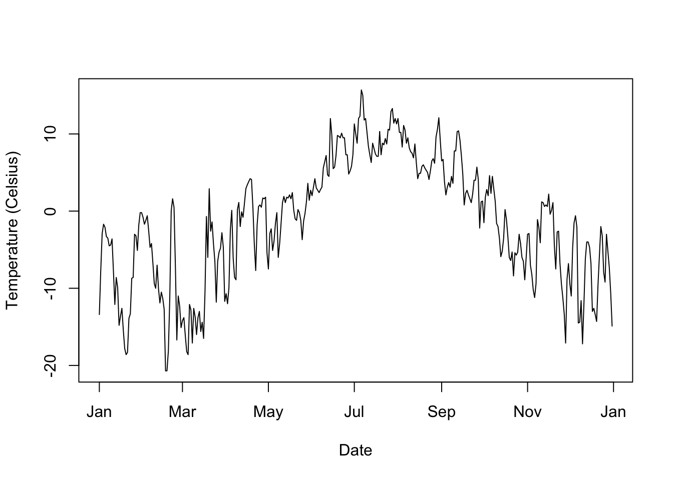
Figure 8.1: Static graph of maximum temperature recorded in 2019 in Svarbald, Norway, data source: US National Oceanic and Atmospheric Association
This is just a simple static plot, but we probably would like an interactive version, which we can do easily.
library("ggplot2")
library("plotly")

p <- ggplot(df2, aes(x=day, y=maxTemp)) +     # set plot axes
  geom_point(shape=1) +                       # Use hollow circles
  geom_smooth() +                             # add smoother
  labs(x = "Day", y = "Temperature (Celsius)")# add labels
ggplotly(p)
Figure 8.2: Interactive graph of maximum temperature recorded in 2019 in Svarbald, Norway, data source: US National Oceanic and Atmospheric Association
Here we have used an interactive plot. You can use the buttons in the top bar of the graph to pan and zoom in to different parts of the plot. You can also mouse over individual data points to see their actual values. If you click on the blue line, this gives the model value provided by the smoothing curve.
We can think of this as predicted value of maximum temperature for a corresponding date. We might use this to estimate max temperature in a future (i.e., unknown) year. However - if this year was particularly cold or warm, it might not be a good estimate. This is why most weather forecasting takes into consideration long-term averages called climate normals.
In this view of the data, we also decided not to use a line to connect each observation, but instead used a smoothing function to visualize the general structure of the data.
Does this help you see the temporal pattern in the maximum temperature data?
It is not suprising perhaps that the warmest temperatures are in mid-summer. Given the location of this station, located here in Svalbard, Norway, even the warmest temperatures are still fairly cool days. With can also use the location to have a look at what the landscape looks like Explore this 360 degree photo and see if you can see the meteorlogical station where this data we are plotting was generated.
8.3.2 Two-Dimensional Views
While we can consider the Svalbard time series plot as bivariate because we have two axes defined upon which we plotted the data, with geospatial data we usually think of a 2D plot as one where both axes represent a dimension of space or time (i.e., we have two independent variables). When both axes are defined according to a spatial dimension (e.g, latitude and longitude, easting and northing, \(x\) and \(y\)) we call this a map.
While maps comprise a lot of different map elements which aid in understanding - in its purest form we have a graphic visualization of a spatial distribution. In digital geovisualization, different tools are used for mapping. Lets revisit weather data but move to a more familiar location. Since we are going to be mapping geospatial data in a 2D geovisualization, we probably want more than one station of data (i.e., a single point on a map doesn’t tell you much about spatial variation - which is typically what we are interested in when mapping).
#CA = stations_ogimet(country ="Canada", add_map = TRUE, date = as.Date("2020/01/25", "%Y/%m/%d"))
CA = read.csv('CA.csv')
p <- ggplot(CA, aes(x=lon, y=lat)) + geom_point()
ggplotly(p)
Figure 8.3: Meteorological stations in Canada, data source: http://www.ogimet.com/home.phtml.en
Looking at this map we can see (hopefully) this is indeed Canadian data given the shape of the distribution of points (representing met stations). Two points standout as potential errors we might want to investigate further. Mousing over one at the bottom and in the middle we see that lon = -96.61668 lat = 43.73335. If we query the data for this, we can find out which station this is;
#which have a latitude less than 45 and a longitude less than -85
CA[which(CA$lat < 45 & CA$lon < -85),]
## X wmo_id station_names lon lat alt
## 130 130 71168 Sioux Falls Climate, Sd -96.61668 43.73335 481Which we can see is indeed a station in Sioux Falls. So we will drop it from further analysis
#drop the row with the station from the US
CA <- CA[!CA$wmo_id == 71168,]
There are countless ways to visualize the spatial distribution meteorological stations. We could simply map their coordinates as we have done above, however in some areas like Southwest Ontario where we have lots of points, so it is hard to see as so many point symbols are overlapping.
We could instead focus the map in a particular region, but then again we would fail to see the broader national-scale picture. Just as we used a smoother to visualize the broad scale variation in the time series plot above, we can take the same approach with the spatial data, and map the spatial density of the point distribution.
There are again many ways to map a spatial density, and if you are interested in learning more about these techniques you might want to explore classes in spatial analysis (e.g., GG361 at Laurier for example).
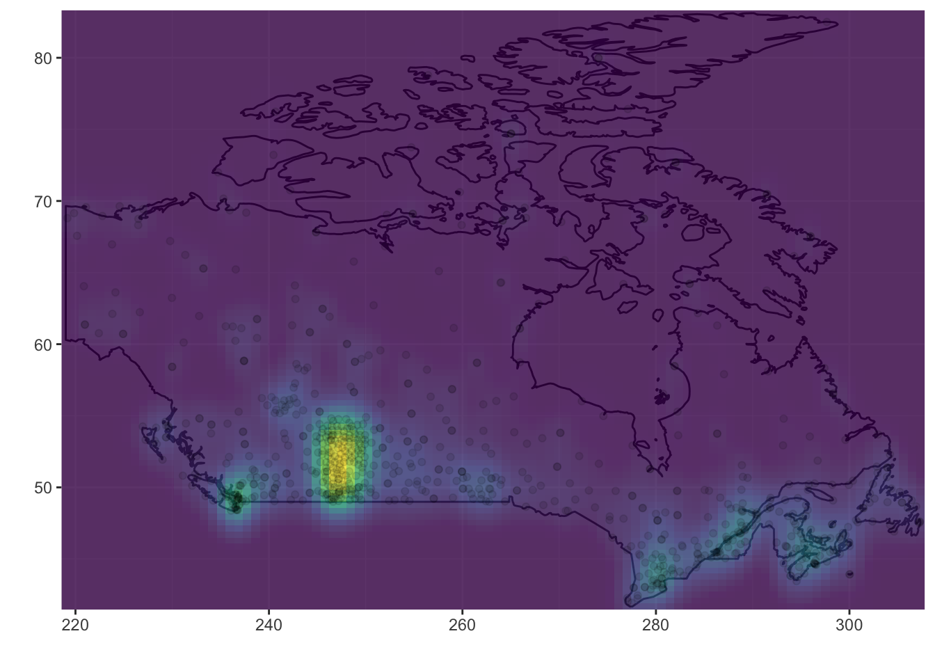
Figure 8.4: Meteorological station as 2D density map in Canada, data source: http://www.ogimet.com/home.phtml.en
Here we have visualized the spatial distribution using a density surface mapping method. The details of how this spatial smoother are not important now, but you have probably seen these sort of heat maps before, where the heat or colour ramp corresponds to the spatial density of the point features being mapped.
These heat maps often provide a compelling visualization but may not tell us anything we don’t already know about the spatial pattern. Here we can see that by far the most met stations are concentrated in the Prairies, the biggest agricultural region of the country. Other hotspots include southern Ontario, Vancouver, and Montreal.
8.3.3 Three-Dimensional Views
A 3D visualization environment for geospatial data is required for true Digital Earth exploration. As we have covered previously, Google Earth is the most widely used GE application in the world today. Google Earth provides ready access to 3D content integrated with high resolution satellite imagery and the ability to load your own data. You should definitely explore Google Earth and get familiar with how to use it. Here are some stunning examples of 3D visualization using Google Earth.
Here is a sample of global flight data, showing the top 10 destinations and their inbound and outbound flights. With an earth-based visualization we can see global connections not otherwise apparent on a 2D map.
Figure 8.5: Global flights data visualized on an interactive 3D Globe. Data available in threejs package
While many GIS programs allow you to view topographic data, this is often not true 3D data. True 3D geospatial data has full access to all three spatial dimensions (x, y, z). Here is a sample of geovisualization of geological data which requires full 3D representation. Whereas a 2D raster map is made up of a grid of pixels, a 3D map is made up of a volume of cells called voxels.
The video above is a demo from a GIS software company in summer of 2020. The addition of full 3D geovisualizaiton capability to Digital Earth tools is a relatively recent phenomena and promises to be a big change in how we work with geospatial data. All of the examples here have all three dimensions encoding space, but we can also 2D space + 1D time as a geovisualization approach. This satellite-based high resolution imaging video (below) would be an example of this type of data.
8.3.4 Four-Dimensional Views
All of the complexity in 3D data plus change-over-time gives us 4D data. For now, we do not really have 4D geovisualization capability in current Digital Earth tools.
8.3.5 Dashboards Views into the Digital Earth
Geospatial dashboards, once a fairly rare corner of the GIS world favoured by government planners and corporate managers involved in large-scale planning, have gone mainstream during COVID-19. Virtually every public health authority, department of health, or centre for disease control has created some sort of online dashboard for reporting data on COVID-19.
A dashboard is a single online interface that includes multiple views of data, usually 1D time series plots, thematic bart plots, and at a 2D map for visualization of geographic data. The most famous COVID-19 Dashboard is the John Hopkins University COVID-19 Dashboard. Take some time to explore the interface (this dashboard was built with GIS software).
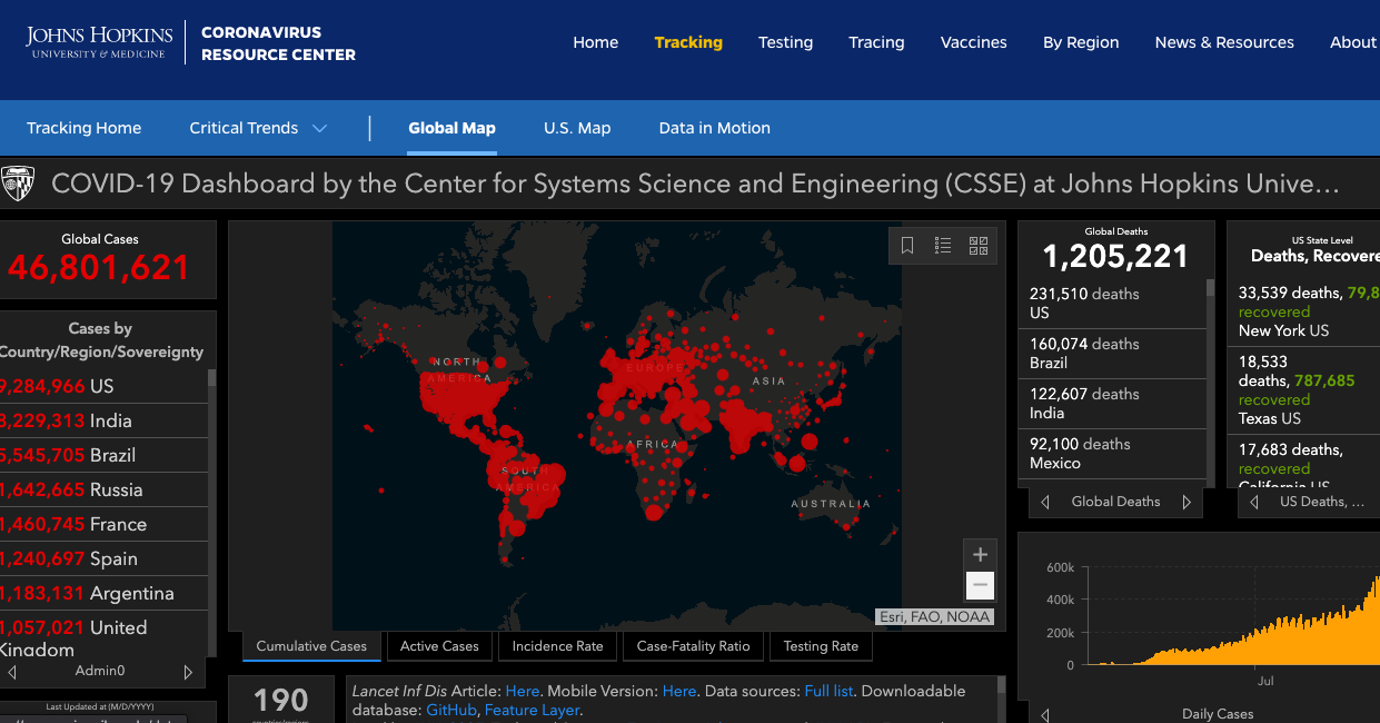
Figure 8.6: Screenshot of the interface of the John Hopkins University COVID-19 Dashboard
There are some key features of the dashboard we can highlight. Try clicking on a country name and you will notice that the map pans and highlights the country, and the epi curve plot is upated with that countries data. Filtering data through linked visualizations is called linking, while highlighting specific data points or subsets through linked visualizations is called brushing.
Stop and Do - 1
Zoom into Canada a bit and examine the subnational data. Do you notice anything unusual about where the points are located? Can you see any issue with this representation?
8.4 Earth System GeoVisualization
While the examples we looked at above give us an idea of what sorts of tools and approaches are available for geovisualization, we know that the value of the Digital Earth really accelerates when we bring together multiple types of data together. We will examine some existing geovisualization platforms for earth systems data, tools that are essential to understand our changing planet.
8.4.1 NOAA View Data Exploration Tool
Description: The NOAA View Data Exploration Tool is a webmap interface to earth systems data for the entire globe. This includes data describing oceans, atmosphere, land, cryosphere (i.e., snow/ice), climate, and weather forecast models. Here we show how to use the model data to forecast snowfall up to 16 days in the future.
Datasets on the NOAA tool have rich metadata available to learn more about what the data represents. The geovisualization capabilities in the tool are fairly standard, allowing 2D exploration of the data through panning and zooming and a map-animation tool for view change-over-time. The resolution of the data is fairly coarse; focused on global and large-scale regional patterns of key earth processes.
 showing metadata for the Active Fires dataset](images/daa.png)
Figure 8.7: Screenshot of the interface of NOAA View Data Exploration Tool showing metadata for the Active Fires dataset
8.4.2 Global Climate Dashboard
Description: The Global Climate Dashboard created and hosted by NOAA provides an accessible tool for global climate change data. The focus here is on communicating results of climate science rather than as a portal to access raw data. The thematic foci are observed changes in climate, climate variability, and climate model projections. The dashboard visualization interface is 1D only, showing change over time in three user-selected variables.
Viewing the data on Spring Snow Cover (million km\(^2\)) shows how observed snow cover compares to the longterm average. Clicking on the learn more link brings up a detailed report of an analysis of changing spring snow cover, including details on how snow cover is measured.
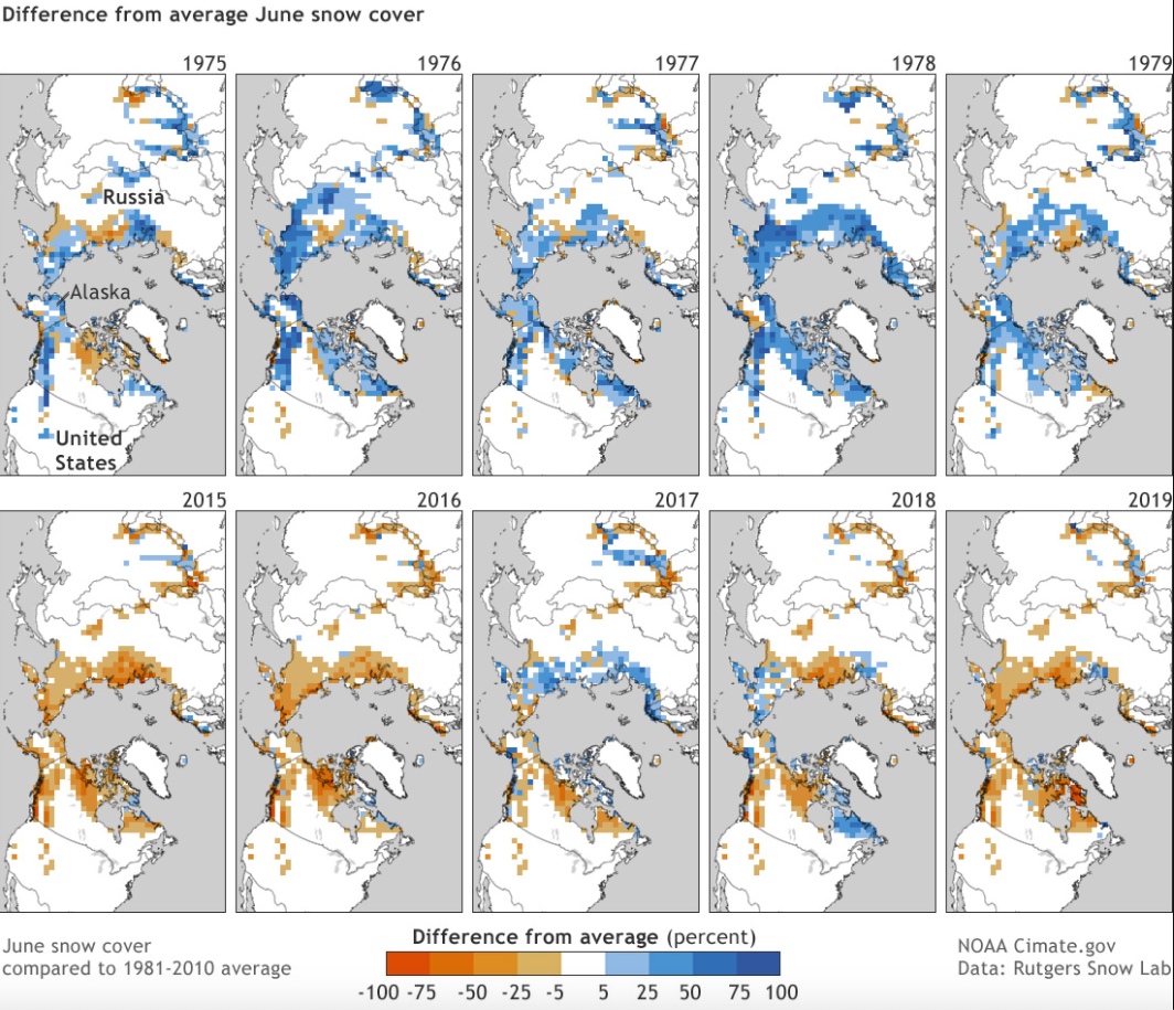
Figure 8.8: Screenshot of the linked report based on climate.gov data on long-term changes in observed global spring snow cover
8.4.3 Arctic Biodiversity Data Service
The Arctic Biodiversity Data Service is a set of Digital Earth tools created and managed by the Conservation of Arctic Flora and Fauna, which is the biodiversity working group of the Arctic Council. The ABDS has limited visualization of the data layers themselves but functions as more of a data-catalog, providing access to curated datasets on processes and indicators important for monitoring change in the Arctic (see for example Figure 8.9 below).
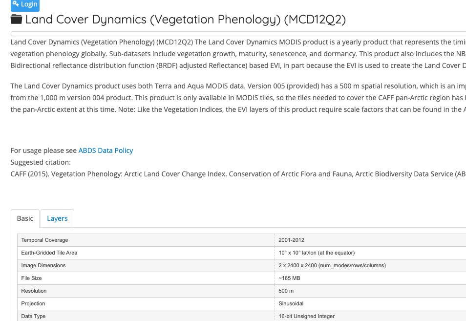
Figure 8.9: Screenshot of a dataset from the Arctic Biodiversity Data Service
Stop and Do - 2
How effective are dashboards at communicating complex environmental processes? Try to come up with three advantages and disadvantages of these sort of dashboard visualizations for earth system data.
8.5 Story Maps: Digital Earth Storytelling
The views of the Digital Earth we have explored are all designed to facilitate data exploration and in some cases data discover and data access. In the Global Climate Dashboard tool we saw links to external reports that provided a contextualized analysis of the data, highlighting important changes based on scientific study. This need for more interpretation of raw data, richer and more narrative story-telling approaches with Digital Earth data have also emerged in recent years.
One set of tools for creating this narrative is called a Story Map which is a 2D webmap that has linked views and mixed of geospatial content, images, text and even video and sound. These other forms of content are anchored to their related geographies through the map, and the reader can navigate to pre-specified locations in the map and see information within their geographic context. As such story maps have been used in both natural science and social science applications of the Digital Earth.
8.5.1 Case Study: City of Kitchener Lifestyle Segments
The City of Kitchener has launched several story maps, and one in particular provides a good example of the idea of mixing media types with a web map interface. The PRIZM5 Lifestyle Segments categorizes Canada’s population into 68 lifestyle types which captures demographics, lifestyles and consumer behaviours methodology. This sort of segmentation analysis can be useful for planning government services and for companies to know about differences in local markets.
Stop and Do - 3
Explore the City of Kitchener PRIZM5 Lifestyle Segments story map. In particular explore the Top 10 Lifestyle Segments which links the segment type with the spatial distribution of people classified in that segment.
8.6 The Power and Limits of GeoVisualization
The UCGIS paper on geovisualization we linked to at the beginning of the topic introduced a conceptual model for geovisualization introduced by Alan McEachern, called Cartography\(^3\). The model links together three dimensions upon which we can evaluate a geovisualization tool.
](images/geovizmodel.png)
Figure 8.10: The Cartography3 model of geovisualization, image source UCGIS/Alan MacEachren
On one axis is the task complexity; which varies from simple information sharing to knowledge construction. As the field of geovisual analytics has emerged in recent years, more geovisualization tools are capable of deriving new and original insights by working directly with data.
On another axis is the degree of interaction in terms of how much the user can actively engage with data in the geovisualization tool. Typically, higher interaction is associated with higher task complexity - so more complex knowledge construction tasks require more input from the user.
The remaining (vertical) axis represents the expertise of users, from specialists to the general public. The line in the middle of the cube represents the transition from high task complexity, high user interaction, specialist user knowledge geovisualization tools, to tools with lower interaction, requiring less specialist knowledge, and more focused on sharing existing information.
Each of the tools we have reviewed above can be categorized accordign to these three core concepts.
Stop and Do - 4
Using the Cartography\(^3\) framework above, categorize one of the geovisualization tools we have reviewed this week. Provide a sentence describing why you rated it the way you did for each the three dimensions.
Despite the obvious power of viewing and interacting with Digital Earth data through geovisualization tools, there are limits to what can be done through visualization alone. We often want to quantify the patterns we see when using visualization tools. Geospatial analysis tools can be combined with geovisualization to develop deeper insights into environmental change processes.
8.7 Summary
We have seen that there are many ways to view and explore the Digital Earth. We have viewed multiple dimensions of views of geospatial and temporal data, as well as how story maps can enable personal narratives and rich media attached to geospatial data. A conceptual model for evaluating and categorizing geovisualization tools was introduced. The future may require more innovating approaches to visualization of 4D geospatial data.
8.7.1 Key Terms
- geovisualization
- 4D visualization
- Google Earth
- time series
- spatial time series
- story maps
- dashboard